Styles and Themes – What’s the Difference?
- May 7, 2013
- Posted by: Lee Tampkins
- Category: Microsoft Word
Yes, it can be confusing. In Microsoft Word, both Styles and Themes deal with customizations in formatting which effect font styles, size, colors, spacing, etc. Applying and changing styles in Word will change the look and feel of your document. So too, applying and changing themes in Word will also change the look and feel of the document. Both will effect fonts, colors, etc. So what’s the difference? Think of it like this — Styles effect specific areas in your document while themes effect the overall look and feel of an entire document.
Still not sure? Let’s get specific. First, let’s take a closer look at Themes.
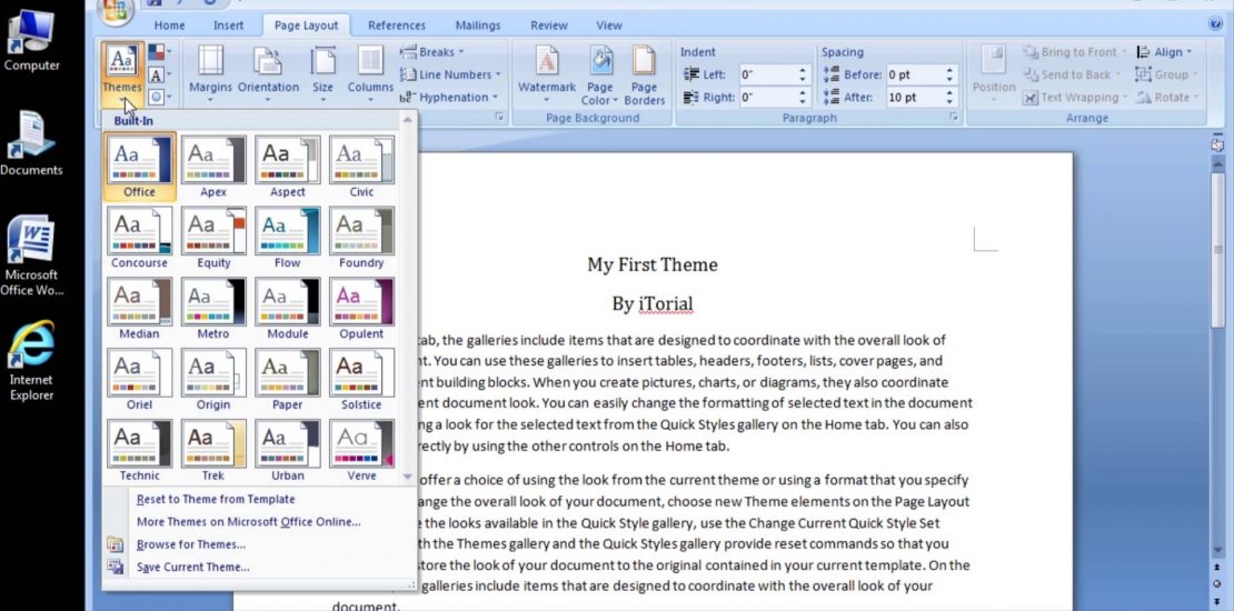
Themes — The Overall Effect
Themes are simply collections of Font Styles, Colors, and Effects — put together in such a way as to create a uniform look and feel. This is why you use themes . . . to create a general look and feel. Basically, there’s 2 things you want to remember about themes:
[list type=bullets-blue]
- They contain 3 things (fonts, colors, effects)
- They effect the overall look and feel of the entire documented
Remember This — Themes Control 3 Things:
- Font Styles
- Colors
- Effects
A theme pulls together a limited number of each of these formatting elements and groups them into small collections to be used in a complementary way throughout the document. Let’s take a closer look at each element.
Element #1 — Font Styles
The font style for a theme is basically a combination of exactly 2 font styles which look good for a particular theme. This is what you’ll want to remember. You’re dealing with just 2 font styles — a Body font to be used in the bulk of the document and a Heading font for such things are titles, subtitles, main headings, etc. There are no more fonts to deal with. The prevailing wisdom is that a well formatted document will have a consistent look and feel. This is the “theme” . . . and part of that consistency is not getting out of hand with too many fonts. So with a theme you are reduced to simply 2 fonts which complement each other nicely in the spirit of your theme — Body and Heading.
What’s important to remember here is although you may have hundreds of fonts installed on your system which are available to Microsoft Word, only 2 are actually contained within the theme you are using. When you choose a font outside of your theme you actually using a custom font style (that is outside of the theme). It is important to know that by doing so, you are forcing the text which receives that custom font style to remain intact even if you choose a different theme for your document. This is a way of sort of anchoring down a particular font so that it remains the same no matter what theme you choose.
Element #2 — Colors
Each theme contains a color palette of exactly 60 colors. This is actually based on 10 theme colors plus 5 shade variations of each of the 10 base colors. This makes for a total of 10 + 50 color options in the theme . . . i.e. 60. Get that?
Again, as with the theme fonts, the theme colors are limited to a set of just 10 base colors which compliment the theme. It turns out it’s the 10 base colors which give the theme its color character. The rest of the colors in the theme’s color palette are simply shade variations of the 10 base colors. You’ll notice this even if you have no theme in use in your document. That’s because Microsoft Word by default uses the “Office” theme which creates a 60 color palette based on the 10 base colors of the “Office” theme. If you want to use another color you’ll have to go outside of the theme and apply a “custom” color. Restricting the color choices in this way creates a limited palette which keeps the look and feel of the overall document uniform and consistent.
Element #3 — Effects
Documents are more than just words. A rich, engaging document will most likely include content-enhancing objects such as shapes, images, etc. These objects can also be formatted with such settings as shading, outline color, etc. This is the relm of “effect.” Just as with fonts and colors, a theme limits a document’s possible shape effects to a complimentary, but limited number of pre-determined choices. Each of these formatting choices contributes to the general look and feel of the whole document.
Styles — The Dirty Details
While a document’s theme controls the overall look and feel of the whole document, the “style” used controls the specific formatting of elements within a particular part of the document. Styles then are the predefined set of formatting elements in a document such as font styles, font colors, font sizes, etc. that can be used in a specific and predefined place within the document.
Styles deal with the dirty details. Use styles to control the specifics of what formatting is used and exactly where it is used. For example, text used for headings and sub-headings are controled with styles. Many style “elements” (such as Heading, Title, Subtitle, etc.) are used to control the formatting in key places within the document. Let’s take a look at a general list of these style elements and how they are used.
Style Elements
- Normal — This is the main body text used everywhere else in the body of the document. Any text within the document not defined by a specific style will be styled as “normal.”
- No Spacing — This defines text which should have no vertical spacing defined. This is handy to apply to text you want to appear in a tight paragraph within the document.
- Heading 1 — This is the main heading text used at the first heading level (e.g. chapters in a book).
- Heading 2 — A sub-level heading text used just below the main heading (Heading 1).
- Heading 3 — A sub-level heading text used just below Heading 2.
- Title — This is text used for the mail title of the document or major section in the document.
- Subtitle — This is the “sub-title” text which generally follows the main Title text.
- Subtitle Emphasis — A variation of the Subtitle style which adds emphasis to the formatting (generally in the form of a change is color or font styling).
- Emphasis — Any text in the document which should be emphasized (e.g. italics, underlined, etc.)
- Intense Emphasis — Text which is emphasized more “intensely” than with just the “Emphasis” style — most often by using bold text.
- Strong — This is text that should stand out by itself and have strong, bold formatting.
- Quote — This is the formatting applied to any text used to display a quote in the document.
- Intense Quote — Formatting used to more emphasized quotes.
- Subtle Reference — Formatting for text used to cite a reference in the document.
- Intense Reference — Reference text which should be emphasized.
- Book Title — This is used to format text which would appear only once in the document — at the very beginning (as with a book title).
- List Paragraph — This formatting is used primarily to indent a whole block of text (paragraph) used in a list.
The important thing to remember about these style elements is they are all customizable and should be used as building blocks to form the overall styling of the document. Not only can you change the formatting of each style, but you change the style names and create styles of your own. The more you use them, the more you’ll want to make them your own.
Style Sets — Subtle Manipulation
Now, just when we get it all straight we encounter Style Sets. What are these? Well, it turns out these are appropriately named because the short answer is “Style Sets” are simply sets of styles. As we have just seen, styles can be thought of as a list of styling elements (Heading 1, Emphasis, Quote, etc.). This list of style elements is really a Style Set. It is the “default” style set for the document which you have the ability to customize completely. But, what if you wanted to create an entirely different set of styles using the same elements but only with different formatting to create say a more contemporary looking document. Well, you can. Plus, there are many style sets already prebuilt to get you started. These style sets can be applied in one simple action (just by selecting a style set in the list) and instantly the entire document’s formatting changes to the new style. Here, a Style Set acts a lot like a theme, because it changes the whole look and feel of the document in one fell swoop. However, where a theme controls the formatting of the document Color Palette, Font Styles, and Effects . . . a Style Set controls the many varied details of the formatting of the elements in the document in a quick pre-defined way.
Summing Things Up
In Summary just remember Theme control the general look and feel of the “entire” document and do this by limiting the document’s color palette, font styles, and effect (of shapes, etc.). Styles control the detailed formatting of specific text in the document by assigning styling elements to text in various places in the document.
Quick Summary
- Themes – 3 things: Color Palette, Font Styles, Effects. The scope is for the entire document.
- Styles – Detailed and predefined styling for text elements of a document. A single is applied to specific text within the document.
- Style Sets – A set style elements as defined in the document’s list of styles. They are used to apply document-wide changes to quickly change the look and feel of the entire document by manipulating the formatting made possible with styles.
Resources:
Style basics in Word
Word 2010 Styles and Themes
